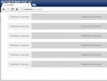
Flexible Grid System (or just flexible.gs) is a relatively new grid system on the Web tools market that has gained a lot of attention and followers thanks to a well design product.
To plot out a responsive grid, flexible.gs uses a combination of CSS classes that allow developers to control the number of columns on which content can span depending on the device used to view the site.
There's a pre-configured list of layouts that the Flexible Grid System caters to out of the box, covering today's most used mobile devices.
The class names are quite self-explanatory and easy to memorize and they can be used selectively, depending on which medium you want to target and control the layout for.
Besides classes to create the grid layout, classes to control the gutter and the grid element's alignment are also included.
The grid system has been tested on most mobile and desktop browsers, and also comes with a special package for using with Ruby on Rails applications.
Hozzászólás nem található